Design

Responsive Websites for Every Screen

Fast, modern, fully responsive websites that deliver a seamless experience on desktops, tablets and mobile devices.

Overview

Responsive Web Design

Many visitors will see your website on a phone first. Responsive web design means layouts, images and navigation adapt to every screen size — so the experience is equally clear and fast wherever someone finds you.

A mobile-first experience

Content and actions prioritised for small screens, then expanded for larger ones.

Faster loading

Properly sized images and lean code improve performance on mobile networks.

One site for every device

A single codebase and URL structure that is easier to maintain and better for SEO.

What’s included

Key features

  • Mobile-first responsive design
  • Cross-browser and cross-device compatibility
  • Flexible grids and adaptive layouts
  • Touch-friendly navigation
  • Responsive images and lazy loading
  • Core Web Vitals optimisation
  • SEO-friendly responsive structure
  • Accessible typography and contrast
  • Responsive landing pages
  • Conversion of fixed-width sites

In detail

How we deliver Responsive Web Design

We design and build mobile-first: starting with the smallest screen forces clear priorities, then layouts expand to use the extra space on tablets and desktops. Images are served at appropriate sizes, interactive elements are large enough to tap, and navigation stays simple on every device.

Before launch we test on real phones and tablets and across major browsers, and measure loading performance on mobile connections. If you have an older fixed-width website, we can convert it to a responsive design while keeping your content and URLs intact.

Common use cases

Business websites A professional presence that works on every device.
Landing pages Campaign pages that convert visitors from mobile ads and social media.
Legacy site conversion Make an older desktop-only website mobile-friendly.
Web app front ends Responsive dashboards and portals that work on tablets and phones.

Our approach

Our Responsive Web Design process

  1. Content priorities

    We decide what matters most on the smallest screen.

  2. Mobile-first design

    Layouts are designed for phones first, then tablets and desktops.

  3. Build and test

    Development and testing on real devices and major browsers.

  4. Measure and tune

    Performance is measured and optimised before launch.

Related work

Projects involving Responsive Web Design

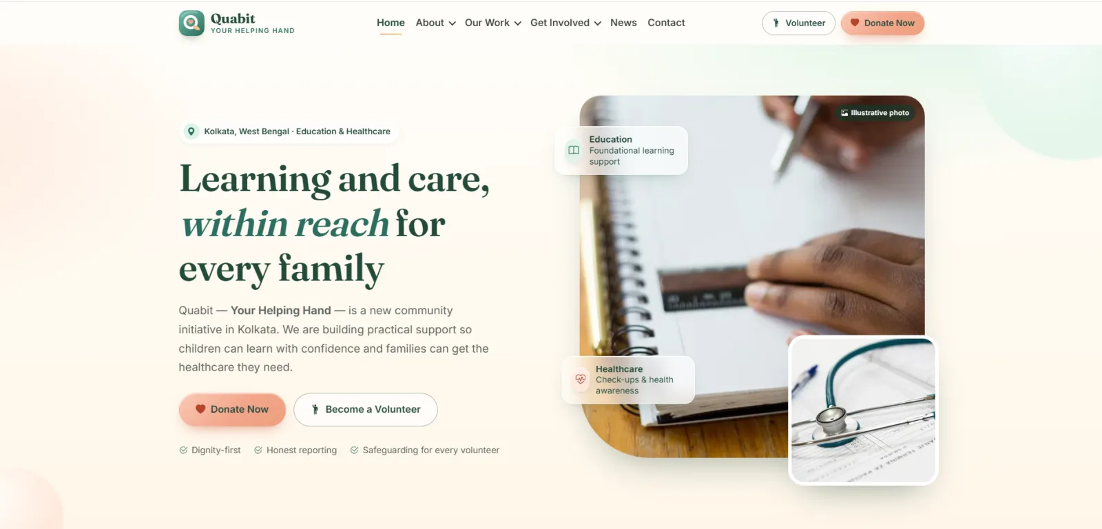
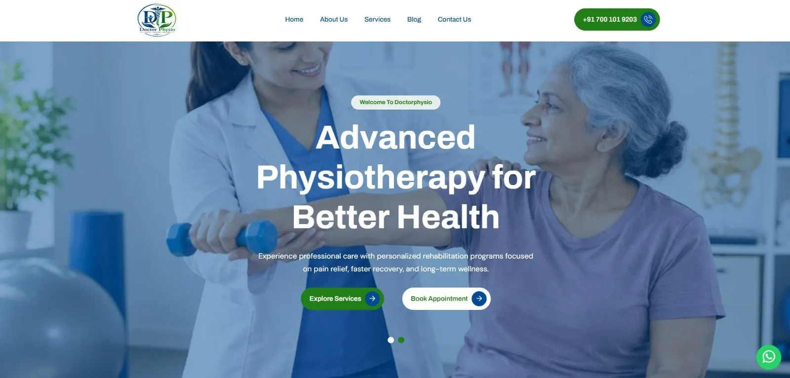
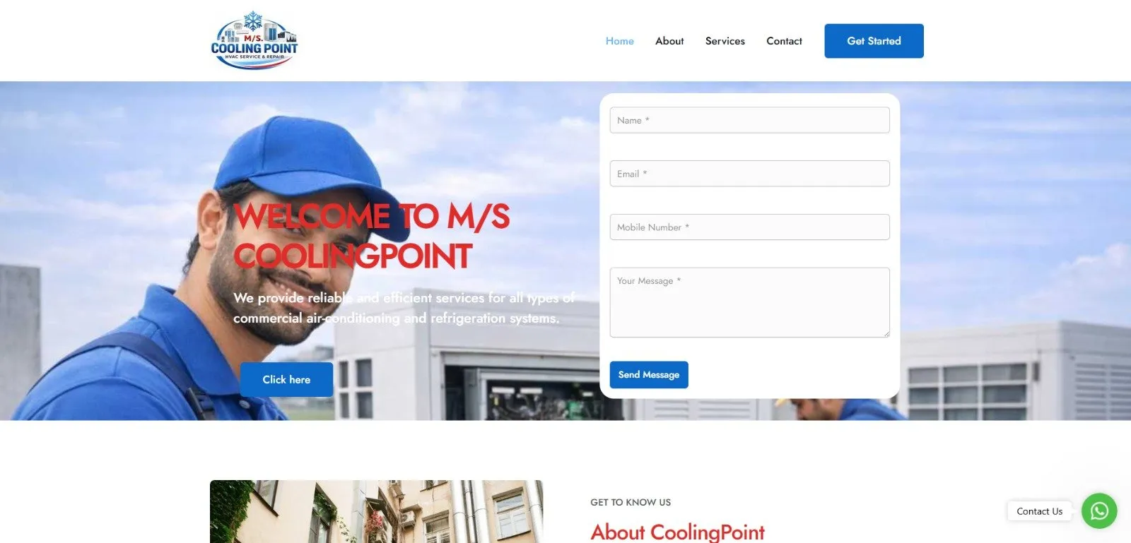
Modern Corporate Website Design & Development

QuaBit - Modern Corporate Website Design & Development

Designed and developed a modern, responsive corporate website for QuaBit Technologies, showcasing software development, digital solutions, and…

Frontend and presentation: HTML5 · CSS3 · JavaScript · Bootstrap 5 — list these only if confirm · libraries · hosting platform · analytics tools · or integrations used in the delivered pr · with human review and testing as applica
FAQ

Frequently asked questions

Can’t find your answer? Ask us directly.

A responsive website adapts its layout to any screen size from one codebase. “Mobile-friendly” is broader; responsive design is the most common and maintainable way to achieve it.

Google primarily uses the mobile version of a page for indexing and ranking, so a fast, usable mobile experience supports your search visibility.

Often, yes. Depending on how the site is built we either adapt the existing templates or rebuild the front end while keeping the content.

Explore more

UI/UX Design

User-centred interface design, wireframes and prototypes that make web and mobile products easy to use.

Custom Web Development

Fast, secure, fully custom websites and web applications built around your workflows, brand and growth plans.

Let’s talk

Ready to talk about Responsive Web Design?

Tell us about your goals and timeline. We’ll reply with practical advice, a proposed scope and an estimate.